
Ux/Ui
Ux Researcher
Interaction
Prototyping
.png)
Veterinar Toran
A new digital suite transforming the user journey through intuitive design, seamless interactions, and clear communication at every touchpoint.

Research
Vibe Coding
UX/UI
Design System
Ai
The What & The How
Problem Space
The brand has an outdated identity and unclear messaging. The website is hard to navigate and doesn’t clearly explain services, leaving users confused. Phones are constantly busy, support is hectic, and the overall experience feels unstructured.
Value Proposition
Redesign the brand with a modern, value-driven voice. Create a seamless digital experience with clear, accessible services, foster trust and empathy, and reduce support friction through online booking.
Strategy procsses
From Support Friction to Digital Flow
1
System Foundation
Defined the core design system and logic-driven brand book to ensure consistency across the website and mobile platforms.
2
Resource Orchestration
Architected a confidential scheduling engine to automate appointment logic, eliminating manual support bottlenecks and streamlining service flow.
3
Component Expansion
Scaled the logic to secondary nodes, including services, blog modules, and e-commerce layers.

Scheduling System
Confidential project, showing high-level flows only.


A Glimpse into the System


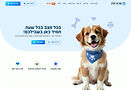
Website
A Home page that says
you’re in the right place
Simple words, warm visuals and soft animations welcome users from the very first moment. A calm, thoughtful layout guides them naturally, offering clarity without pressure. The experience feels light, friendly and intuitive, with space to grow as the brand grows
01
Who says a Branch page
can’t make life easier
A calm and clear space that brings essential information and quick actions together, making progress feel natural and easy.
02


An About page that feels
like getting to know a friend
Friendly words, real stories and thoughtful visuals make the page feel open and human. Instead of long text, it shares the vision and values in a simple and honest
03
The Before

Vibe Coding
Built the project using vibe coding with Figma Make
• Worked with two core files, a design system and a design file, with full design system application throughout
• Used precise prompts and hands on refinement to recreate the layouts
• Adjusted text styles manually where Figma Make did not apply them correctly
• Exported gradient visuals as JPG files since gradients are not supported in Figma Make

Project Conclusion
Users scan, not read.
The content was simplified, reshaped into clear headings, and focused on key messages that are easy to absorb. Smooth scrolling and clear calls to action help users understand the story quickly and keep moving with confidence.
Clearer Structure for Faster Decisions
There was a lot of repeated information that made the page confusing and hard for users to scan. For example, in the subscription plan, I clarified the structure by showing the shared benefits once with clear icons and repeating them as simple bullet points inside each package. This makes the content easier to read, supports quick comparison, and improves the overall decision experience.
+972 549917303
Einavmshelh@gmail.com